SharePoint branding: What it is, and why you should care
This past week, Entrance’s SharePoint Consultants upgraded our site to SharePoint 2013. We are looking forward to trying out some of the new capabilities that 2013 will provide us! I wanted to take a few minutes to talk about one awesome option in the SharePoint toolbox: branding!
It’s Not Just Skin Deep
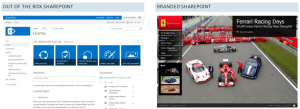
Many companies simply don’t think of it, but branding your SharePoint site is important. When it comes to the ‘skin,’ i.e. the fonts, colors, graphics and logos, out-of-the-box SharePoint is not generally representative of an organization’s corporate culture.
This look and feel elements help establish the solution as your own and defines the beginning and end of your solution for the end user.
 Consider the example to the left. The branded Ferrari site looks and feels like the company, with navigation that goes beyond the plain user experience of the out-of-the-box platform.
SharePoint can be the voice of your organization. Don’t let that voice be a boring deviation from the corporate marketing standards!
Reasons to Invest
There are a few good reasons to consider investing in branding:
1. Increased user adoption
2. Enhanced collaboration between information workers
3. Improved and streamlined information architecture for navigation
Beyond the look and feel of your SharePoint site, the way your company works should also be a huge consideration.
Branding is not just skin deep, it is not just cosmetic, in fact it goes all the way to the core of uncovering and exposing the content your information workers are looking for in the fewest number of clicks.
Information Architecture, ease of use, simple and intuitive navigation and consistent content layout are integral parts of SharePoint branding.
By providing a user friendly interface you will increase user adoption and promote collaboration amongst your information workers.
Reducing the number of clicks it takes an end user to find their content can go a long way to promote user adoption. Taking the time to map out your information architecture is always time well spent prior to rolling out a new or updated SharePoint solution.
Getting Branding Right
In order to accomplish these goals for one Entrance client, we evaluated the current SharePoint sites and solution and:
- Conducted executive interviews. We asked these executives what their vision for a portal would be.
- Then, we surveyed the organization to gain broader insights into corporate needs.
- The final step in the planning process was to hold design workshops with key business stakeholders to see how they really worked.
This process helped us to get a very clear picture of the business need, and how to deliver a solution that meets those needs.
The new site will feature on-brand colors, custom icons, and an intuitive home page design. Over the next four months, we will also set up features document libraries, workflows, and notifications.
This will contribute to user adoption by offering one organized and central location for all information. Branding the site makes the decision to use SharePoint that much easier.
For more on branding, read this post from our SharePoint consultant with a few more reasons to considering taking the plunge!
