Imagine that you are a intensely focused on managing railroad crossing safety by improving rail-highway crossings that are the site of accidents involving trains and road vehicles or pedestrians. While all crossings may be of interest, you want to triage the 500,000 crossing in the US to determine those that most urgently need attention to safety conditions.
We want our dashboard information system to answer these questions at a minimum:
- What are the Rail-Highway crossings that have an unusual number of Incidents?
- At which crossings are rates of incidents increasing?
- What are the crossings with fatalities or injuries?
- Are the rates at a crossing increasing or decreasing over the years?
- Are the incidents associated with vehicles stopped on the tracks or other causes?
For instance, here we see grade crossing incidents in the Houston area with 3 or more incidents in 6 years, or with 2 or more showing fatalities. We select the second bar in the Fatality plot showing 3 fatalities in 2014, see that it is Fondren Road. From the map, it is At US90 and In the table we see highlighted that it occurred Sept, 6, 2014 at 18:38, Vehicle going 15 mph, Train going 35, the passenger was killed, driver injured.
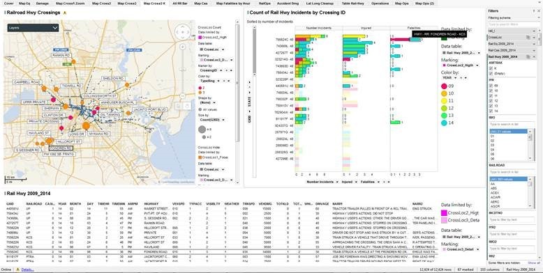

The Visualization displays here are constructed in Tibco Spotfire 6.5. The real public domain data used in the analysis comes from the Federal Railroad Administration – Office of Safety Analysis [2]. There are six tables with data from 2009 to 2014.
LAYOUT OF THE DASHBOARD
Let’s start near the end — at the main decision dashboard, “Map Crossings(2)”, and understand what is displayed and how it answers our key questions interactively.
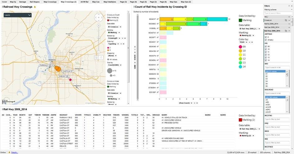
The dashboard below shows Rail-Highway Crossings in the central Houston Area that have had at least two incidents in the time frame: 2009-2014.
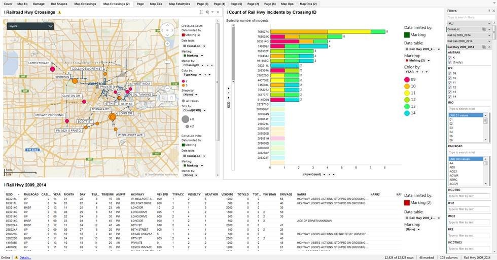
The upper left is a map chart with two marking layers, zoomed into the Houston area. One layer, CrossLoc Index, are the small blue dots scattered across the map. These are the Rail-Highway Grade Crossings from the GCIS database — They follow the rail lines and indicate every place where a railroad crosses, or crossed at one time, a highway. The other layer, CrossLoc Count, is the active layer of the map and highlights the crossings of interest. Bubble size is the number of incidents in the time period, Color is the type of grade crossing, with Orange being the guarded public crossings, the Red being less guarded crossings on private, railroad, or industrial property. The labels are the highway or street names at the grade crossing.
The upper right is a horizontal bar chart showing on the vertical, category axis the ID of the Grade Crossing, the horizontal, value axis is the total number of incidents in the time period. The stacked bars are the number of incidents at that grade crossing by year, with red for the older reports, green-to blue for the most recent.
The lower panel is a details extraction of the Rail Hwy 2009_2014 data table for the selected and highlighted grade crossing where you can learn the day and time of the incident, how fast the vehicle and train were going, which direction, how much damage, number of injuries or fatalities and a text summary of what happened.
INTERACTIVITY OF THE DASHBOARD PANELS
Let us refine the search and look at only 2012-2014 incidents.
Filter the IYR to (12, 13, 14). In the Right Hand Bar chart, Select the bars with at least 2 in the Row Count (X-axis). There are seven such crossings that we see names on the Map and each incident listed in the table at the bottom.
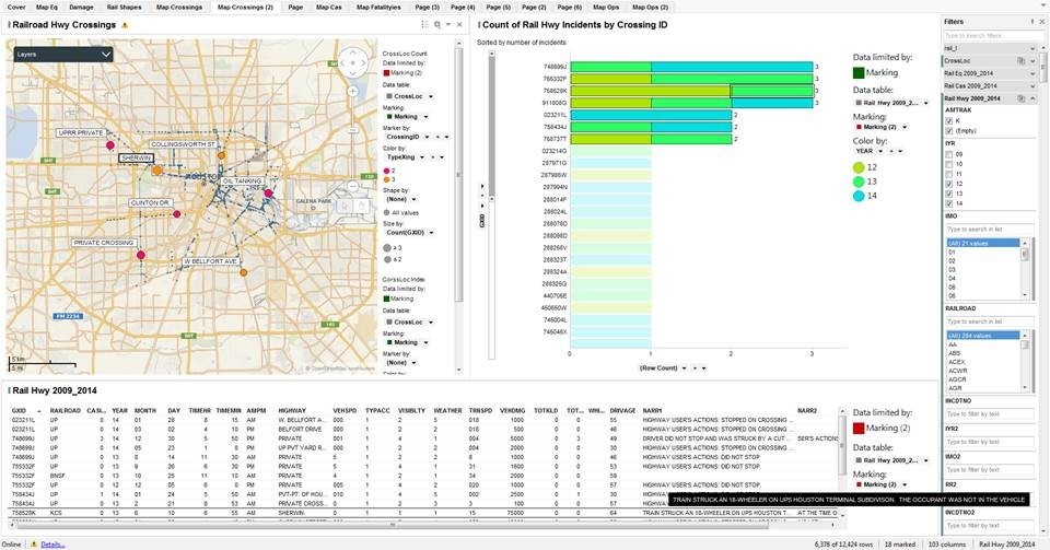
Here we “brush” the table record for the Sherwin June 10, 2013 accident, Crossing ID = 758528K, where we see a “Train Struck an 18-Wheeler” where “the occupant was not in the Vehicle at the time of the accident.” It happened at 6:55 am, weather and visibility good, the vehicle was stopped, the train going 15 MPH, no injuries but $75,000 in damage.
Now let’s check the entire network of BNSF. Goto the Map Crossings, Filter on Railroad =”BNSF”. Select all the crossings. Goto the Map Crossings(2). choose years 2012-2014 (IYR=(12, 13, 14)) and select the bars with 3 or more incidents.
Bookmark: BNSF 2012-2014, marked with 3+ incidents, then changed the filter to all years. In this view, we have the all year count, but we highlight only those with three or more in the past three years.
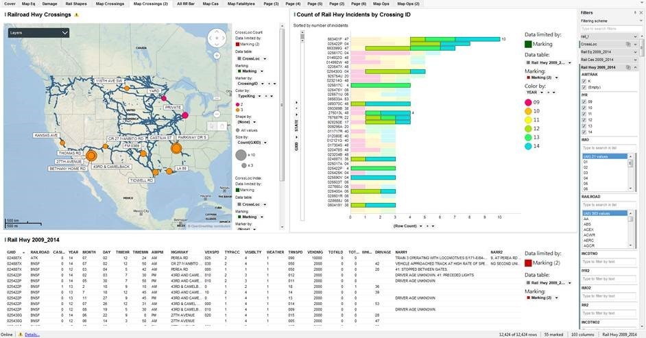

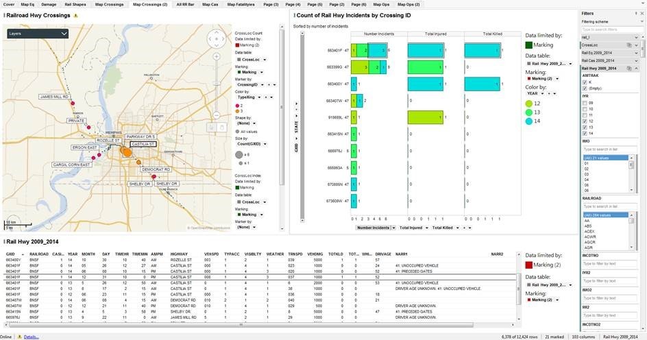
Castilia St and Parkway Dr S in Memphis, Tenn seem to be a hot spot. If we zoom into the Memphis area, we see these two intersections, within a mile of each other, have 12 accidents in the past three years.

Here we have modified the upper right bar chart to show the number of incidents together with the total injuries and total killed (included in injuries). Castilia St is at the top of the list with 3 accidents in 2014 with one fatality, 10 pm on New Year’s Eve.

IN CONCLUSION
The objectivity of a tool like this is critical to health & safety planners. Imagine how it could be applicable for local governments and safety-conscious industries as well. With more data sources, including urban development and traffic information, you could even start to build out more predictive analytics to determine which areas will become higher risk in the future, and plan for safety improvements there.
[2] Data Source: http://safetydata.fra.dot.gov/OfficeofSafety/publicsite/on_the_fly_download.aspx — As of January 25, 2016. Data downloaded by year for the years 2009 through 2014 for the following tables:
- Rail-Highway Crossing Locations
- Rail-Highway Casualties
- Rail-Equipment Incidents
- Rail-Operations
- Further, we downloaded the tables from the GCIS, Grade Crossing Information System, and used the Grade Crossing Locations table: CI_LocationAndClassification.csv (120 MB)
[3] North American Railroad Network – ArcGIS Shapefile
http://www.arcgis.com/home/item.html?id=476e6223627944bc8e8ecfddfff16bd2
