SharePoint and Your Dashboard
Last week, I started a blog series based on my lunch and learn, “SharePoint for Upstream.” I plan to share a few strategies and best practices that people in Upstream can use to improve the visibility and control they have over their data.
Last week, I discussed the importance of actionable information. I also shared some statistics from a Schlumberger study that show how much time people waste on identifying and prepping information.
When the information that people have is not accessible and digestible, oil and gas employees spend more than 80% of their time on activities that add no value to the decision making process. It’s clear then that tools like SharePoint can make a big difference in surfacing the resources people need.
Let’s start with dashboards as the first SharePoint tool that your company could leverage today for this purpose.
How is a dashboard different than a report?
As an Upstream company, you may be saying, “But we have reports!” That may be true, but the key here is context. A SharePoint dashboard puts information next to other information, which translates into better insight.
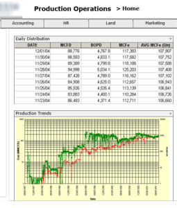
For example, you might use a dashboard to show net and gross production for the last rolling 90 days. This is a high level view, and much like the dashboard of your car, there is a check engine light.
The check engine light lets you know that you need to look further into a problem. Similarly, if production is down, the dashboard can throw up a red flag alerting your team of an issue. You can then drill down into data that specifically relates to that problem.
With a more simple Excel based reporting system, you might have to dig through multiple spreadsheets to find the data you need, and then spend more time making sense of that data. Even worse, specific issues might not come to light for months if they are buried in a spreadsheet.
You know that there are always improvements to be made to the process and problems to be solved. A SharePoint dashboard highlights these specific issues for you, so you know where to spend your time fixing them!
Dashboard drill-down
As I alluded to earlier, one of the great benefits of a dashboard is the ability to drill down into and filter data. You might start with an overview of your company’s assets types, and as necessary drill down by levels, from the field to the well to completions.
 From there, you might also want to sort wells by operating/non-operating or those producing gas versus oil. The dashboard enable you to do all of this within one easy-to-use interface.
To take this a bit further, another benefit to a SharePoint dashboard is the ability to visualize information. You may not be able to see a trend when it is spread numerically across several reports. Overlay that data visually with several different data sets, however, and previously unmade correlations suddenly become possible.
One-stop shop
There are many dashboard additions that can help keep you informed and provide the visibility you need from one location. For example:
Financial variance
- LOE versus budget versus actual
- Production forecast versus actual
- AFE versus Actual Incurred Cost
Timeline visualization
- Development schedule
- Rig plan
- Days/Depth graphs
Public Financial Data
- Stock ticker
- Commodity prices
- Hedge positions
Other possibilities
As maps have made their way from the G&G world into the management/financial side, a map of fields + production, for example, can be one valuable addition to your dashboard. You might also consider:
- Day/month/quarter production trends
- Safety stats
SharePoint provides a flexible platform
SharePoint is by no means the only platform that can be used for your dashboard. Since many companies already using this product though, this flexible platform can be an obvious choice.
Download our dashboard planning kit today to get started laying out what your customized dashboard would look like. We would love to walk you through choosing the ideal platform to match these goals!
